


Development Intensity: First Draft
In trying to figure out an answer to yesterday's question -- what's the relationship between quality of life and energy efficiency? -- I discovered that getting a good answer may be more difficult than I had hoped. Although metrics such as Gross National Happiness and the Genuine Progress Indicator offer tantalizing perspectives on the measurement of quality of life and non-economic development factors, their application has been (as far as I could find) fairly inconsistent and far from global. As a fall-back, I took a look at the United Nations Development Program's Human Development Index, part of the annual Human Development Report. The HDI combines measurements of literacy/education enrolment and life expectancy along with purchasing-power-parity-corrected GDP; it doesn't include any measurements of pollution or environmental sustainability, "happiness" or comfort, or creative or innovative output. Although it's a bit more complex than GDP alone, I'm afraid that it still puts too much emphasis on classical economic activity.
The most recent UN HDI came out in 2005, and covers the year 2003; as a fortunate coincidence, the most recent data on international energy use from the US Department of Energy also goes up to 2003. I ran a direct comparison between the 2003 HDI value and the gross energy consumption per capita figure from the DOE, then plotted the results. Here's the 2003 chart, grouped by the UN's broad development ranking (high, medium and low):
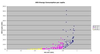
(click for larger version)
As a broad rule, energy use per capita increases along with development, hardly a surprise. The handful of countries that fall well outside of this pattern are, for the most part, oil-rich nations (UAE, Saudi Arabia, etc.) that have very high per-capita energy use along with mediocre development scores. This tells us, essentially, that countries with more active economies tend to have better health and education levels, along with higher energy use.
Looking at a few select countries over a multi-year period, the story gets slightly more complex. Australia, Canada, Sweden, the US, Japan, the UK, Mexico, Brazil, China and India are familiar figures from the various efficiency and intensity explorations I assembled at WorldChanging. The following chart shows the HDI to energy comparison for 1997, 2000 and 2003, with the spot size based on how much "development" each state got per unit of per-capita energy.
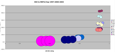
(click for larger version)
For the low and medium developed countries, the relationship is pretty straightforward: more energy=more development, with higher development levels more "costly" in energy required.
The highly developed nations are a bit more of a jumble. All six of the selected countries rank very close to one another in terms of HDI. Japan and the UK (#11 and #15 on the HDI list, respectively), along with Canada (#5), seem to follow the general rule that a higher HDI means more per-capita energy use. Australia (#3 on the HDI list), Sweden (#6) and the US (#10) tell a different story; Australia and Sweden both use less energy per person than the US, while still ranking higher. Moreover, Australia and Canada are both trending up in per capita consumption, while Sweden and the US have sharp downward trends.
What does all of this mean?
In and of itself, not a lot. Aside from confirming some already-expected results, the figures at the high end are too closely tied to GDP -- and too noisy -- to tell us much that's new. Still, it's a good baseline to work from, and as I bring in metrics around use efficiency (energy/GDP) and other quality of life metrics, we can refer back to these charts to help us find the surprises.